Petavue Visualization: A Guide to Creating Charts and Visual Insights
Visualization is where analysis turns into understanding. Petavue’s charting experience builds on the platform’s plan-first workflow and turns your results into clear, presentation-ready visuals you can trust. This guide walks through how charts are generated, how to interact with them, and how to refine them through simple follow-up prompts.
Why Visualization Matters
Tables show the facts. Charts show the story.
Patterns that are difficult to spot in rows and columns: seasonality, outliers, relationships between variables, become clear through visual representation.
Petavue ensures those visuals are grounded in verified, plan-approved analysis so they remain accurate and auditable, consistent with Petavue’s core workflow described in the platform guides.
1. How Charts Are Created in Petavue
Visualization is always done after an analysis has run. This keeps charting aligned with the plan-first philosophy: first align on definitions, sources, and steps, and only then visualize the output.
Prerequisite: Complete an Analysis
An analysis must be executed before charts can be created. Every analysis follows the same flow — ask a question, review the plan, modify, approve, execute, and receive results — outlined in the analysis workflow guide .
Once your results are produced (often as several result tables), Petavue’s visualization layer can use them to create charts.
2. Quick Start: Creating Your First Chart
A Real Example
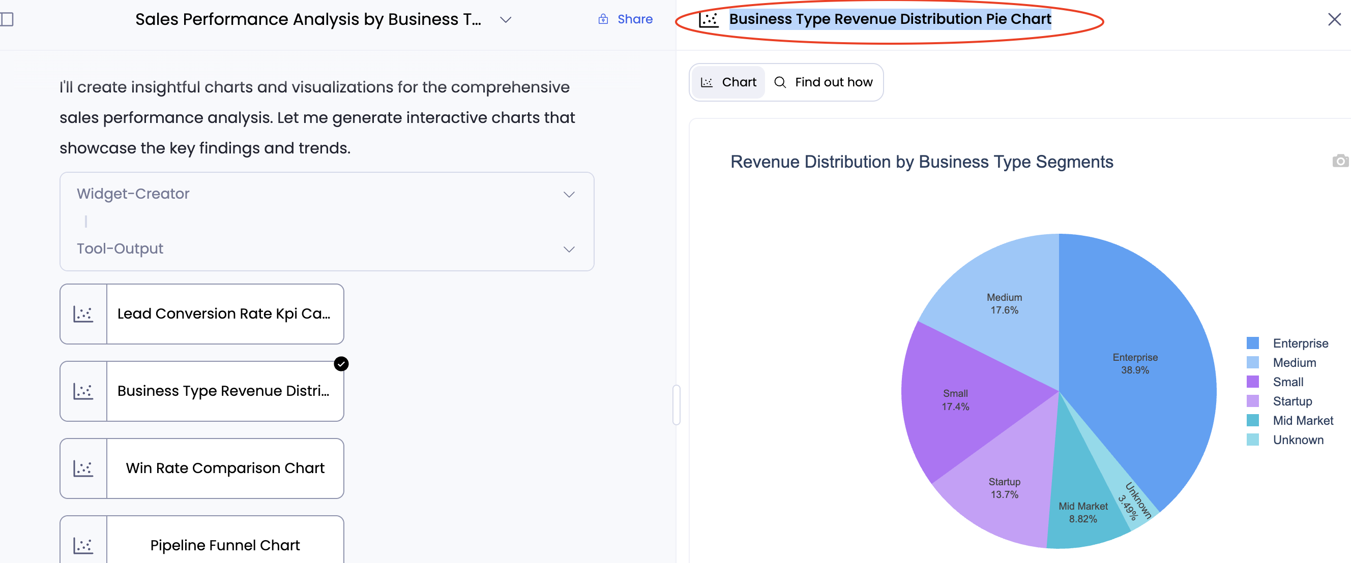
Suppose you want a comprehensive sales performance analysis covering trends, segment breakdowns, pipeline conversion, touch-to-win correlations, and geography. You prompt Petavue with that multi-part question.

Petavue responds by:
- Generating and presenting a multi-step plan.
- Running those steps after approval.
- Producing a set of tables with the findings.
When the results appear, you simply ask:
“Can you create me insightful charts for above analysis?”

Petavue automatically produces a set of charts derived from the tables, no manual work required.
This workflow mirrors the example approach used across Petavue analyses, where results lead directly into summaries, validations, and visualizations.
3. Supported Chart Types
Petavue can produce a wide range of visualizations, from foundational charts used in business reviews to advanced data-storytelling visuals.
Standard Visualizations
These are the fundamental charts used for standard reporting:
- Bar Charts: Horizontal and vertical bars for categorical data comparison.
- Line Charts: Visualizing trends over a continuous scale, such as time.
- Scatter & Bubble Plots: Displaying relationships between two or more variables.
- Histograms: Showing the distribution and frequency of numerical data.
- Box & Violin Plots: Summarizing data distribution, quartiles, and potential outliers.
- Pie & Donut Charts: Illustrating numerical proportions and part-of-whole relationships.
- Area Charts: Line charts with the area beneath the line filled in.
- Dot Plots & Strip Charts.


Advanced Visualizations
For specialized data stories, Petavue supports:
- Geospatial Maps:
- Choropleth Maps: Shading regions based on a numeric value.
- Scatter Maps & Density Maps: Plotting points or heatmaps on interactive tile map layers.
- Geo/Outline Maps: Using geographic coordinate systems for general maps.
- Hierarchical & Flow Diagrams:
- Sankey Diagrams: For visualizing flows and processes.
- Funnel & Funnel Area Charts: Perfect for pipeline analysis.
- Heatmaps


4. Two Ways to Ask for Charts
Chart creation happens through conversational prompts—the same way you run analyses.
Option 1: Prompts for overall visualization
Useful when you want visuals for the entire output.
Examples:
- “Plot charts for the above analysis.”
- “Visualize the results.”
Petavue scans all result tables and produces appropriate charts for each.
Option 2: Prompts for specific visualizations
Use this when you want to focus on particular metrics, segments, or styles.
Examples:
- “Create a bar chart showing the top 5 industries.”
- “Plot a scatter chart showing ARR vs. sales cycle length.”
- “Make a chart for the segment breakdown from the results above.”
This aligns with the platform’s prompting guidelines: be specific when necessary, especially when you want a particular style or metric breakdown.
5. Viewing and Interacting with Charts
When charts are generated, they appear in the right-side visualization panel.
Interactive Tools
- Zoom & Pan: Click, drag, or scroll for detailed exploration.
- Box-Select & Lasso: Zoom into selected data clusters; double-click to reset.
- Find Out How: Opens the Details and Code view, letting you see the underlying tables and generated code—consistent with Petavue’s “no black boxes” philosophy and full transparency for tool execution .
Exporting Charts
To use visuals in slide decks or documents:
- Adjust the chart to the scale you want.
- Click the camera icon in the chart toolbar.
- The chart downloads as a JPEG.
This mirrors Petavue’s broader export abilities, such as PDF report generation from completed analyses using the MCP client .

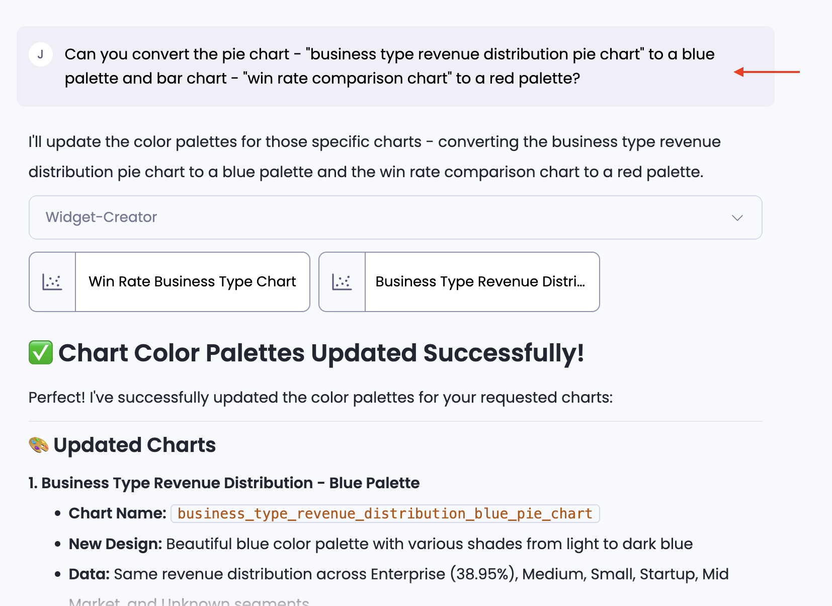
6. Refining and Correcting Charts (Follow-ups)
Just like updating a text analysis, you can refine your charts using follow-up prompts. Below are common scenarios and how to handle them.
Scenario 1: Visual & Aesthetic Adjustments
You want to make the chart look better or match your organization's branding.
Making text stand out
"Make the axis labels bright and bold."
Changing the font or title style
"Change the font of the title to Arial and print the Y-axis label horizontally."
Improving bar readability
"Have bar values printed on top of the bar (not just showing when highlighting)."
Branding compliance
"Change the color of the charts to Navy and Teal as per our organization's branding guideline."
Legend positioning
"Position the legend at the bottom center."
Scenario 2: Metric & Data Formatting
The chart is correct, but the numbers need to be presented differently.
Changing the calculation (Count vs. Ratio)
"Update the chart to show the % ratio of deals instead of the count."
Adding context (Trendlines)
"Please add a trendline to this chart."
Currency abbreviation ($500k)
"Instead of printing $500,000, please update the label to print it as $500k."
Missing metrics (Correlations)
"Plot the correlation between discount rate and win rate."
Scenario 3: Structural Changes
You want a completely different way of visualizing the data.
Changing the Chart Type
"It gave me a bar chart, but please show this as a funnel chart."
Changing the Sub-type (Stacked vs. Grouped)
"Convert that to a grouped bar chart."
Defining Grouping logic
"Make the X-axis the Region, and group the Color by Product Type."
7. Best Practices
Copy the Header to Make Changes:
If a specific chart needs to be changed, copy the Header Name of that chart and mention it in your follow-up prompt so the system knows which one to edit.
Ask for Suggestions:
If you don't know the best way to visualize data, ask for advice.
- Example: "What's the best way to see the impact of sales touches on conversion and if there is a correlation? What charts can be created?
Handling Visual Deviations (Iterate):
The system creates a "1st version" of the chart. You might notice texts clashing, labels that are too small, or colors that aren't appropriate. This is normal. For the final presentation, simply note these changes and correct them in a follow-up prompt (quoting the chart header). You can do multiple corrections in a single prompt.
Separate Analysis and Charting:
Avoid writing a prompt where you plan an analysis AND ask for a chart in the same sentence. Always complete the analysis first, then ask for the charts separately.
Combine Multiple Analyses:
You can combine outputs from different steps into one visualization request.
- Example: "Create charts for results from the above 2 analyses."


8. Troubleshooting & Validation
If something looks off:
- Validate the underlying tables produced by the analysis via Find Out How.
- Confirm the metric definition (especially if a KD may apply).
- Revisit the analysis plan or run a quick column/dataset diagnosis—tools Petavue enables explicitly for validating data before relying on results.
Petavue helps you move from raw data to narrative insights; fast and with confidence, and without ever touching code.
If you need help, the Petavue support team is always available at support@petavue.com